


JessTH
Becoming Colour
Becoming Colour
Couldn't load pickup availability
Becoming Colour - by Jess Thompson-Hughes
500 limited edition hand embellished available reproductions available
A quiet, intimate moment is set against an explosion of colour and movement.
Viewed from behind, a woman gathers her hair above her head, seemingly unaware of the observer. Her figure is rendered with a degree of realism that contrasts sharply with the fractured, graffiti-like environment surrounding her — layers of vivid blue, red, yellow and black that have been scraped, dragged and allowed to run across the canvas.
Yet the boundary between figure and background is deliberately uncertain. Fragments of colour cross the woman's skin, as though the world behind her is beginning to inhabit her — or perhaps she is emerging from it.
At its heart, Becoming Colour explores the relationship between stillness and chaos, intimacy and observation, figurative painting and abstraction. The smallest of everyday gestures becomes a moment of private calm while the world around it remains gloriously unsettled.
A critical analysis:
My reaction to it
There are really two paintings happening simultaneously.
The woman is handled comparatively traditionally. She's recognisable, dimensional and physical. There is warmth in the skin, careful modelling around the shoulders and back, and some lovely observational touches — particularly the ear and earring, the hands disappearing into the hair, and the changes of tone across the back.
Then behind her you've got something almost completely different: scraped, dragged and layered paint, exposed canvas, drips, blocks of intense colour and passages that feel almost like urban graffiti.
That collision works.
In fact, I think the unfinished relationship between the figure and background is probably the most interesting thing about the painting. The blue, red and yellow don't remain obediently behind her. They begin to invade the body. There are marks across her back, thighs and legs which appear to belong simultaneously to the environment and to the woman.
That makes her feel as though she is either emerging from the painting or gradually becoming part of it.
And I much prefer that interpretation to seeing the background simply as decoration.
The composition
The pose is very strong.
Both arms rise and converge around the hair, creating a loose triangular structure, while the dark hair itself provides a visual pathway down towards the head. Your eye starts near the top, follows the hair, reaches the face and shoulder and then travels down the spine.
There's also an interesting contradiction in the pose.
She's exposed — almost entirely unclothed and viewed from behind — yet she doesn't particularly feel vulnerable. Because we cannot see her expression and because her arms are raised, she seems self-contained. She isn't presenting herself to the viewer.
We're observing a private moment.
That distinction matters.
The small red garment then becomes an extraordinarily strong visual anchor. Among all that cyan, scarlet, yellow and black, it creates a point at which the abstract and figurative halves of the painting meet.
What I particularly like
I actually wouldn't want the figure rendered much more perfectly.
Some of the most successful passages are where your abstract marks have been allowed to remain across the skin. The red scrape across the shoulder, the blue/red marks lower on the back, the marks across the legs — those imperfections stop the woman looking as though she's simply been painted on top of an abstract background.
She's embedded in it.
There is also something rather contemporary about the contrast between beauty and visual noise. She is performing one of the most ordinary, intimate human actions imaginable — tying up her hair — while everything around her is frenetic.
So despite all the colour, I find the central figure surprisingly calm.
That gives the painting an interpretation I rather like:
stillness within chaos.
___________________________________________________________________________
Professionally calibrated Giclee printed to reproduce exceptionally vivid colours using the latest large-format printers at 2400 dpi using a 12-colour pigment ink system for smooth graduations, deep blacks, and an impressive colour range - with up to 99% Pantone coverage.
Materials
Materials
Shipping & Returns
Shipping & Returns
Dimensions
Dimensions
Care Instructions
Care Instructions


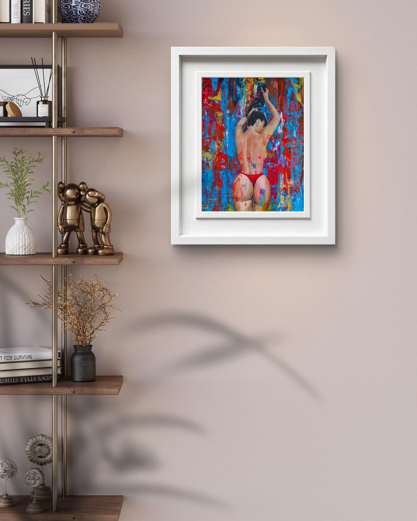
Image with text
Pair text with an image to focus on your chosen product, collection, or blog post. Add details on availability, style, or even provide a review.
-
Free Shipping
Pair text with an image to focus on your chosen product, collection, or blog post. Add details on availability, style, or even provide a review.
-
Hassle-Free Exchanges
Pair text with an image to focus on your chosen product, collection, or blog post. Add details on availability, style, or even provide a review.